2026 Paint Color Trends: A Timeless Palette for Elevated Interiors
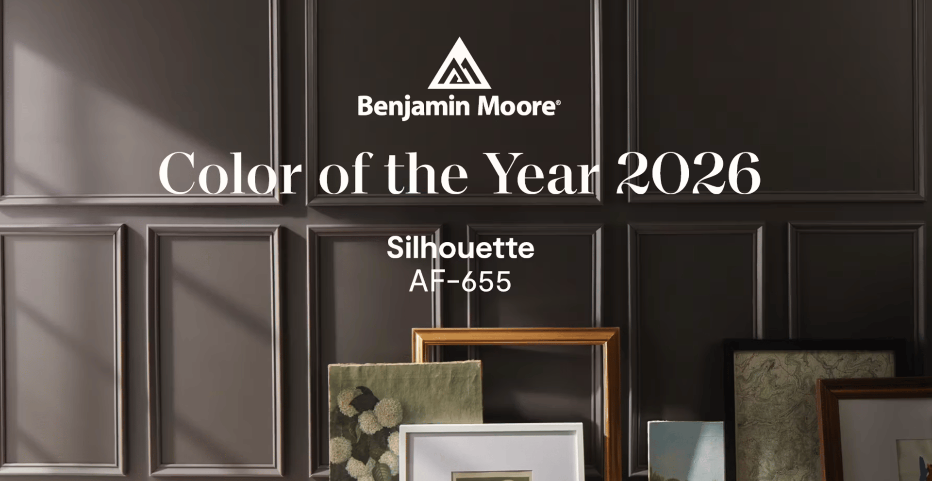
As we look ahead to 2026, paint color trends are shifting in a meaningful way. Instead of bold, fleeting statements, we’re seeing a return to balance — colors that feel grounded yet poetic, classic yet fresh. The 2026 color palette is all about intention, craftsmanship, and quiet confidence.
These are hues that don’t shout for attention, but instead bring depth, warmth, and sophistication to a space. Whether used on their own or layered together, this palette offers a timeless approach to interior design that feels both livable and elevated.
A Return to Thoughtful, Timeless Design
The defining theme of the 2026 color trends is restraint. Rather than chasing extremes, these colors live comfortably between light and dark, soft and strong. They honor traditional design principles while still feeling modern and relevant.
This palette is especially well-suited for homeowners who want their spaces to age beautifully — colors that feel just as appropriate in a historic home as they do in a new build.
Crafted Colors with Depth and Presence
Each color in the 2026 palette feels intentional, as though it was chosen with craftsmanship in mind. These hues have enough depth to stand confidently on their own, yet enough subtlety to layer seamlessly with other tones, textures, and finishes.
Expect shades that feel:
-
Soft but not washed out
-
Deep without feeling heavy
-
Classic without appearing dated
This balance makes the palette incredibly versatile for whole-home color schemes, accent walls, cabinetry, and trim.
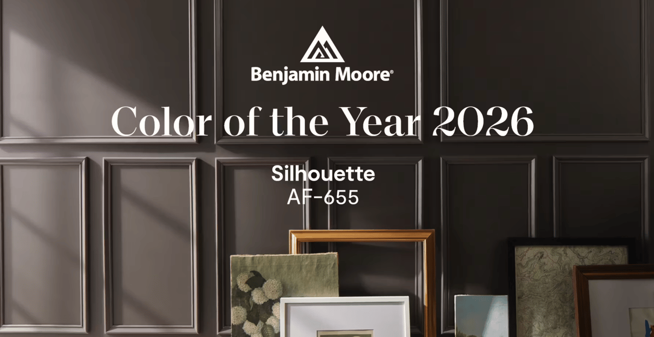
Silhouette AF-655: The Anchor of the 2026 Palette
One of the standout colors of the 2026 trends is Silhouette AF-655. This refined neutral brings effortless elegance to a space, making it a favorite for homeowners who want warmth without sacrificing sophistication.
Silhouette works beautifully:
-
On walls for a soft, elevated backdrop
-
On cabinetry for a tailored, custom look
-
Paired with natural wood, brass, stone, and layered textiles
It’s the kind of color that quietly enhances everything around it — a true design workhorse.
How to Use the 2026 Color Trends in Your Home
These colors are meant to be lived with, not just admired. Here are a few ways to incorporate the 2026 palette into your space:
-
Layer neutrals with intention: Pair warm, grounded tones with lighter, ethereal shades to create depth without contrast overload.
-
Highlight architectural details: Use deeper hues on built-ins, trim, or doors to add character and dimension.
-
Let texture do the talking: These colors shine when paired with natural materials like linen, wool, wood, and stone.
-
Design for longevity: Choose colors that will still feel relevant five or ten years from now — not just this season.
Why These Color Trends Matter in Real Estate
As a luxury Realtor®, I see firsthand how color choices impact the way a home is perceived. Timeless, well-chosen paint colors photograph better, appeal to a broader range of buyers, and help a home feel cohesive and intentional.
Homes that lean into classic palettes with depth and warmth often feel more refined — and more valuable — from the moment you walk through the door.
Final Thoughts
The 2026 color trends signal a return to what truly lasts: thoughtful design, quality craftsmanship, and colors that feel like they belong. This palette isn’t about reinventing your home every year — it’s about creating a foundation that evolves gracefully with you.
If you’re considering a refresh, these hues offer a beautiful starting point — elegant, versatile, and undeniably timeless.